
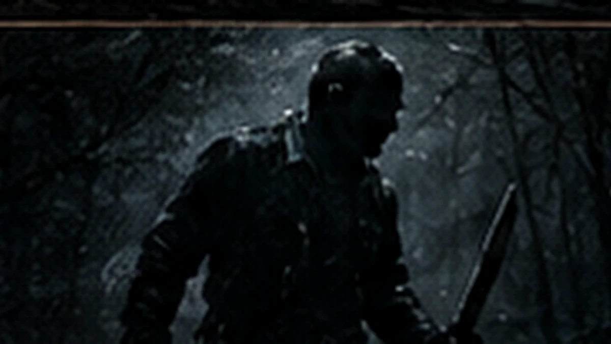
Jason Voorhees is so visually efficient that it is easy to remember him as if he appeared fully formed in 1980. He did not. The franchise spent several films assembling the figure audiences now recognize on sight.
First, a story told by someone else
In the original film Jason is the child at the center of Pamela Voorhees’s grief and rage. He is history, motive and nightmare imagery—not the adult killer driving the plot.
Then, a human threat in the woods
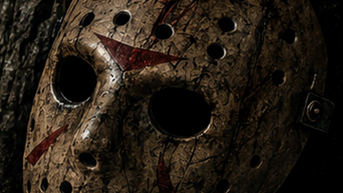
Part 2 turns Jason into the active murderer, but the familiar mask is still missing. He is rougher, more improvised and more plausibly human. Part III supplies the hockey mask, solving the franchise’s visual problem with one brutally simple shape.
Death stops being a boundary
The Final Chapter tries to kill Jason decisively. A New Beginning experiments with the idea of Jason as an imitated image. Jason Lives then makes the supernatural transformation explicit: the character is no longer merely difficult to kill; he is a resurrected horror monster.
Later films can send him to Manhattan, Hell, outer space and a crossover with Freddy Krueger because the core design remains readable. Mask. Large silhouette. Deliberate movement. Sudden violence. The location can change without losing the icon.
The mask is continuity when continuity fails
Friday the 13th has never required perfectly clean chronology. Jason’s visual identity performs the job instead. Different performers, makeup approaches and damage patterns become variations on the same symbol. That flexibility is the real engine of his longevity.
Leave a Reply